New Bond – Shaken, Not Stirred T-shirt
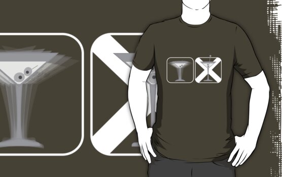
It’s been a while since I’ve done any new designs, but with the new Skyfall Bond film imminent, I thought I’d dust off an idea I’d had quite some time ago, and was surprised I hadn’t seen done anywhere else.
I’m a bit of a fan of infographics, and this one could jokingly be used to inform your bar staff of your cocktail preferences. Maybe there’s a series in here somewhere?